Wednesday, 19 January 2011

What's in a sign? 20 is Plenty


There is arguably no road sign more important than the School warning triangle; however, the shape categorises this danger with mere inconveniences like ‘Hump Bridge’ and ‘Hill incline/decline’. In Hampshire, many schools have signed up to replace these with a more engaging, persuasive sign, encouraging motorists to keep to a maximum speed of 20, which regular signs astonishingly don’t specify. Written in childish type and colourful letters is the headline ‘20 is plenty’ which appears above a childish drawing of a snail. 

The concept is to attract motorists’ attention using a child’s perspective. This informs the basic tone of voice – the simple rhyme, the colourful type and the popular child symbol for slow, the snail. This evokes a human connection with distracted motorists (absent in the red triangles) and provokes motorists to empathise with the concerned parents and choose everyone’s wellbeing above their adrenalin. The execution creates a perfect balance between the nondescript triangle and the shock strategy used by brands such as Think! while using only three elements to clearly and convincingly highlight that children’s safety is at risk. 

Friday, 14 January 2011

One Last 2010 List - Print and Digital

Shelter


When I was researching for a report on the Third Sector last year this really caught my eye. It shows such insight to present this complex issue - the staggering rates of house price inflation - in a simple, accessible way.


KitKat

The early bird catches the worm. The longest tennis match in history spanned three days and JWT apparently produced this in no more than an hour for it to be on display as soon as possible. Clearly perfect for Kit Kat since the players were desperate for a break in that fifth set, and in more ways than one!


Viral: Old Spice

Apart from the Nike: Write the Future and some dreadful Shakira video, Old Spice got the most views with 28,185,823 and beat Google and Apple to the title of Most Viral Brand by frequency of videos in chart. They built on their witty, surprising ads with the Responses campaign, putting mediums such as Twitter to full use and supporting the opinion that advertising is set to become more personalised in the future. This is a case study that shows how successful it all was.


Banner: iPod Touch


Purely because I’d never seen anything like it before and as such it surprised and impressed me, all while clearly staying on brief – to emphasise this as the ‘funnest’ iPod yet.


One Last 2010 List

Promise. Just a quick mention for a few ads that didn't appear in the last post, including my pick of the print and digital ads form last year.


The Good: Virgin Atlantic


As if following 'Still Red Hot' wasn't daunting enough, this ad also takes on recreating one of the most iconic title sequences in film history. This takes an entertainingly facetious approach to the Bond scenes and shows that the brand, in all its style and extravagance, isn't taking itself too seriously. As ever, the red uniforms stand out prominently and as so unmistakably Virgin that this would be identifiable as a Virgin ad without any logo exposure. Furthermore, the production is slick as scenes flow seamlessly from one to the next accompanied by a modern take on 'Feeling Good' by Muse. Competitors must watch these ads with the sort of despair last seen on the faces of hapless Bond villains, as the target just jeeps on getting further and further away.


The Bad: Confused.com


Using the title of what you're criticising as its criticism is a bit lazy and not particularly witty. For example, when critics said of Franz Ferdinand's album 'You could have it so much better' that we 'could have it so much better' I rolled my eyes with boredom. However, here there is only one word for confused.com's latest offering: confusing. With this particularly bland cartoon character singing 'Somebody to Love', you could be forgiven for thinking that this is an ad for a dating service for closet homosexuals. If this ad endorses anything, it's the use of an ad agency. Not all in-house ads are going to be as successful as those for affordable glasses; perhaps confused.com should've gone to Specsavers.


The Ugly: VW Polo


In all fairness, this isn't ugly; but since it jumps between good and bad in my opinion, this seems like an appropriate category for it. The dance looks great, it's a popular ad and people remember it; but far fewer people seem to remember what it's for. I think this is because the link between the routine and the final frame is nonexistent. I've seen the Argentine Tango danced in the plazas of Buenos Aires and it is beautiful, here they've choreographed it to look tough, but I don't think it can portray both at the same time. Or, quite possibly, I'm being extra-tough on it because it's a VW ad and they've tended to be so brilliant in the past.


Monday, 10 January 2011

'Best' of 2010

Recently ITV aired what was essentially a 1-hour ad break – Ad of the Year – and The Guardian published Nielsen’s ‘most-liked’ list online.

My response to this was hardly one of universal agreement. Let’s start with the clear offenders.

1. Go Compare (ITV Ad of the Year no20)

Erm… Did I see/hear/read that correctly? As a temporary schoolteacher, one thing I was interested to observe was that the children (8-10) love it; they think it’s hilarious and so catchy that they (irritatingly) love singing it. Hardly the demographic for a car insurance comparison website, though. In my experience, anyone remotely close to their target market and with an ounce of sanity tends to greet the ads with the mute button. Yes, ads are intrinsically intrusive, but come on, many of the ads deservedly in this list are entertaining or charming or thought-provoking, this is no more than brainwashing, repetitive dross and a gung ho response to the competition, which unfortunately for them, is a certain meerkat.


2. Barclaycard (ITV Ad of the Year no2)

Man rides rollercoaster to work. Different and entertaining on paper, despite sounding like a desperate attempt to make financial services popular and accessible post-recession. But then you watch the ad. Blink at the split second of Barclaycard exposure at the beginning, middle and end of the ad and you’ll be completely baffled by what’s going on. For starters you’ll think the man is a perv based on his peering into a half-naked woman’s bathroom and the time he makes his co-worker weak at the knees with the purchase of an apple. Indeed this female pandering to male attention feels better suited to a bygone century and to me implies men dealing with the finances while women watch gratefully and admiringly. Whatever the interpretation, I watched all 90 seconds but was bored after 60.


3. Cushelle (Nielsen ‘likeability’ report no9)

A koala bear hugs a pack of Charmin before darting to the new pack of rebranded Cushelle. Is this all it takes to make the top 10 most liked ads of the year? The fact that it’s non-descript is not, however, the only thing I have against it. Robert Webb. Unmistakeable voice – the same unmistakeable voice that plays Jez ‘dog-eating, sex-crazed, drug-fuelled, work-shy freeloader’ Usborne in Peep Show. Granted, many Cushelle consumers might not also be Peep Show viewers but for me, that voice now has a lot of associations, and cute koala bears hugging soft toilet paper is certainly not one of them.


There was, as expected, a selection of the year’s best ads (not all of them in my opinion – and I’ll return to this in a later post). Of those mentioned, these get my thumbs up.

1. Magners (Nielsen ‘likeability’ report no2)

Magners embrace their heritage and unique production techniques in the Clonmel ads. The ‘catch’ ad exaggerates the natural and careful treatment of apples, neither picking them nor letting them bruise against the earth. Meanwhile the ‘straight’ ad shows the brand’s insistence on freshness, which is obtained from a speedy farm to cider mill delivery. These ideas are made popular through quirky creativity represented by Clonmel’s cricket team and Aiden Boyle, its resident who can only travel as the crow flies. These ads highlight the method behind the production, and the idiosyncratic ways they go about it, which is deliberately portrayed as ‘mad’ bringing my favourite tagline of the year: ‘There’s method in the Magners’.


2. Audi (ITV Ad of the Year no9)

Audi hit us with ‘Beauty and the Beasts’ to promote their high-end Spyder and reaffirm their positioning as a premium brand. The ad shows some great, old but unloved cars driving uncontrollably over the ice to frantic rock music before contrasting these with the Audi, driving controllably and looking elegant, emphasised by a shift to slow, operatic music. The ad communicates the Spyder’s luxury, in terms of appearance and performance and the memorable tagline ‘mirror, signal, outmanoeuvre’ highlights the latter. This fun, imaginative ad also strives to make Audi Britain’s best-loved car brand, through comparisons to a car with a leaking petrol tank and another with ‘unloved’ sprayed on the back.


3. Thinkbox (ITV Ad of the Year no1)

Harvey is not the most appealing dog in the dogs’ home, but Harvey has an ad for himself that is so persuasive that he has already packed his bags by the end. The ad within an ad begins briefly with slight exaggerations before moving towards absurd contrivances so unexpected that the dog-seeking couple couldn’t possibly resist him. This ad makes great use of the ludicrous Harvey ad to amuse viewers while its implied success with the dog-seeking couple effectively communicates the real proposition, to demonstrate the power of TV advertising.


Coming soon, a few comments on some ads not mentioned in these lists, including print and digital media. 

Friday, 7 January 2011

The Matchstick Blog 2011

Yesterday Paul Collingwood announced his retirement from Test Cricket to focus on the shorter format of the game: Twenty20 and limited-overs matches. I am sorry to say that The Matchstick Blog became too carried away with the short form of blogging – Twitter – at the end of 2010, amongst the demanding piles of application forms and multiple temp jobs all being completed in order to keep the dream – an enjoyable career - alive. After varying degrees of success but no offer, I am determined to turn my attention back to the Test Cricket of blogging: Blogging. 

I aim to give a more varied content, with a few regular features long and short. I will endeavour to recall famous ads in a 'Whaam!' feature (a more concise way of saying Blast from the Past – indeed Lichtenstein’s 'Whaam!' involved a blast, and it was created in 1963) and a 'Location, Location, Quotation' feature, sharing some of the great quotations that have been uttered by admen over the years.

'Whaam!': The new Blast from the Past feature for 2011
I will also take a look at the most popular/acclaimed events in entertainment/culture to consider what their appeal is; meanwhile, of course, continuing to look at everyday examples of advertising and branding.

Welcome to The Matchstick Blog 2011. 

Thursday, 9 September 2010

l'Homme/la Femme Automne/Hiver '10

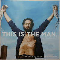
French Connection’s latest seasonal campaign is arguably their most prominent to date. These print ads were splashed on the front, back and inside covers of London’s free magazines Stylist and ShortList last week and the three second average time we have to take in a print ad was plenty to urge me to find out more about them.

Campaign: There are 24 executions in total, clearly split by gender into 10 for the Man and 14 for the Woman. They are visual-verbal print ads with three elements: headline, visual and logo. At a first glance they look great; oozing style and sophistication, the likes of which you would expect from Eduard Grau, a man who worked with Tom Ford on A Single Man.


The Man ads depict a manly Man, so much so that his bearded and well-built appearance and laconic voice (which we can assume is his from the speech marks in the headlines) create an almost Neanderthal portrayal. Furthermore, the headline type suggests strength and boldness and the low-to-high shot angles suggest authority and control. The Man knows his clothes look good, but this isn’t important to him. He is uncomplicated, seeking clothing that will perform the function of keeping him warm during the winter. For the Man, the selling point is therefore the quality of the materials and the products.  

The Woman ads are rich with Parisian influences. Not just from the style of the clothing and the look of the visuals but also in terms of mentality - a confidence that comes from walking down the street knowingly attracting male attention. The emphasis is on the design quality of each individual item. It’s not encouraging layering as many high street stores do, but that less is more to look elegant and attractive. There’s the sense of female superiority that comes with being irresistible to men when you look this good. Men are under their spell and powerless to avert their gaze.

Before these campaigns, French Connection lacked presence and position in the market. The insistence on the Man and Woman stereotype is a reaction to the current androgynous haze that shrouds high street stores. Male and female models are looking more and more similar and this is further exacerbated by them dressing in almost exactly the same trends and often very similar items! This campaign is about men being masculine, and women being effortlessly stylish.

As well as product awareness, it also has an effect on the brand’s positioning. As the quality of the ads highlights the quality of the products, the brand is elevated to a clear position between high street stores and designer boutiques. 

Media: Print
Tone of Voice: (Man) Laconic, Neanderthal insistence on warmth and function. (Woman) Provocative, playful and teasing men through style and fashion.
Proposition/benefit: (Man) Feel like a man, look like a man. (Woman) Look stylish with simplicity, look elegant with ease. 

Advertising Objective: Create separate campaigns for Men and Women, with a sophisticated look and feel, elevating the brand to a higher position in the market. Men’s ads exude masculinity while Women’s show the French Connection look for Paris-inspired, effortless, irresistible style. This creates a clear opposite to the androgynous look shown by most fashion retail outlets at present.

Target Market: Early 20s to late 30s. For consumers who want stylish, smart/casual clothing between designer and high street quality and are willing to pay prices reflecting this.

Competition: Reiss, Karen Millen, Jaeger, All Saints.

Business Problem: French Connection has a lack of identity. Consumers are unsure about its position in the market. Emphasise the quality of the products and the ranges for Women and Men, engaging with a higher-disposable-income market.

This is an effective use of gender stereotyping to highlight fashion vs function. In both cases, one of the two is endorsed; function for the Man, fashion for the Woman. But equally, neither is ignored. For the Man and Woman, fashion and function become implicit in the brand so although they aren’t the advertised selling points respectively, they are nevertheless a certain feature of the product range. As someone who is in the target market in terms of age but not income, I certainly feel encouraged to visit one of their stores. I’ll just be sure to leave the card at home. 

To see more of the campaign, visit the site at this link:

Monday, 6 September 2010

Welcome


For months now I have been looking at adverts and branding with a critical eye. Whether it is the latest ad campaign from the highest spending advertisers such as Procter & Gamble or Unilever, or the front of the local corner shop, if it is an example of using creativity to attract consumers then I am interested. So this blog will include comment on recent news in the sector, profiles on different brands and a look at recent ads - retracing the steps of the brief to uncover the likely thought processes behind the concept and strategy and considering to what extent the ad might or might not deliver the returns that the client had planned.

By now you might be wondering what on earth the Matchstick Blog has to do with advertising and branding, I know I would be. I wanted a name that incorporated both the strategic and creative sides of the industry. On one hand I was considering a name relating to an iceberg as this is often used to pictorially represent the creative brief; and on the other I was envisaging a spark as a good image to suggest how an idea is born within agencies and then becomes widespread when it is revealed to the public in an ad.

For those unfamiliar with the iceberg image, it is a way of showing that the final execution - i.e. what is above the surface - is only a small percentage of the advertising process. Other elements include identifying the Business Idea, the Competition, the Target Market, the Proposition/Benefit, the Tone of Voice and the Advertising Idea. This is my matchstick. The execution is the head of the match, the part that stands out and gives the match its purpose. The stick then represents these other processes, the ones that, to the iceberg, are beneath the surface.

As for the creative side, the flame produced by the match is the idea that is born within an agency and which can catch on and spread like wildfire in the hearts and minds of consumers once it is out in the open.

Any disagreements, please comment! Thanks for reading.