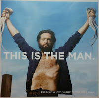
French Connection’s latest seasonal campaign is arguably their most prominent to date. These print ads were splashed on the front, back and inside covers of London’s free magazines Stylist and ShortList last week and the three second average time we have to take in a print ad was plenty to urge me to find out more about them.
Campaign: There are 24 executions in total, clearly split by gender into 10 for the Man and 14 for the Woman. They are visual-verbal print ads with three elements: headline, visual and logo. At a first glance they look great; oozing style and sophistication, the likes of which you would expect from Eduard Grau, a man who worked with Tom Ford on A Single Man.
The Man ads depict a manly Man, so much so that his bearded and well-built appearance and laconic voice (which we can assume is his from the speech marks in the headlines) create an almost Neanderthal portrayal. Furthermore, the headline type suggests strength and boldness and the low-to-high shot angles suggest authority and control. The Man knows his clothes look good, but this isn’t important to him. He is uncomplicated, seeking clothing that will perform the function of keeping him warm during the winter. For the Man, the selling point is therefore the quality of the materials and the products.
 The Woman ads are rich with Parisian influences. Not just from the style of the clothing and the look of the visuals but also in terms of mentality - a confidence that comes from walking down the street knowingly attracting male attention. The emphasis is on the design quality of each individual item. It’s not encouraging layering as many high street stores do, but that less is more to look elegant and attractive. There’s the sense of female superiority that comes with being irresistible to men when you look this good. Men are under their spell and powerless to avert their gaze.
Before these campaigns, French Connection lacked presence and position in the market. The insistence on the Man and Woman stereotype is a reaction to the current androgynous haze that shrouds high street stores. Male and female models are looking more and more similar and this is further exacerbated by them dressing in almost exactly the same trends and often very similar items! This campaign is about men being masculine, and women being effortlessly stylish.
As well as product awareness, it also has an effect on the brand’s positioning. As the quality of the ads highlights the quality of the products, the brand is elevated to a clear position between high street stores and designer boutiques.
Media: Print
Tone of Voice: (Man) Laconic, Neanderthal insistence on warmth and function. (Woman) Provocative, playful and teasing men through style and fashion.
Proposition/benefit: (Man) Feel like a man, look like a man. (Woman) Look stylish with simplicity, look elegant with ease.
Advertising Objective: Create separate campaigns for Men and Women, with a sophisticated look and feel, elevating the brand to a higher position in the market. Men’s ads exude masculinity while Women’s show the French Connection look for Paris-inspired, effortless, irresistible style. This creates a clear opposite to the androgynous look shown by most fashion retail outlets at present.
Target Market: Early 20s to late 30s. For consumers who want stylish, smart/casual clothing between designer and high street quality and are willing to pay prices reflecting this.
Competition: Reiss, Karen Millen, Jaeger, All Saints.
Business Problem: French Connection has a lack of identity. Consumers are unsure about its position in the market. Emphasise the quality of the products and the ranges for Women and Men, engaging with a higher-disposable-income market.
This is an effective use of gender stereotyping to highlight fashion vs function. In both cases, one of the two is endorsed; function for the Man, fashion for the Woman. But equally, neither is ignored. For the Man and Woman, fashion and function become implicit in the brand so although they aren’t the advertised selling points respectively, they are nevertheless a certain feature of the product range. As someone who is in the target market in terms of age but not income, I certainly feel encouraged to visit one of their stores. I’ll just be sure to leave the card at home.
To see more of the campaign, visit the site at this link:


No comments:
Post a Comment